Part 5: Even More Things
The "part" breaks are somewhat arbitrary now, but I figure I'll just keep recording what I'm doing with the codebase and how I'm doing it. Its worth reiterating that I am very much Not An Expert and may well be Holding it Wrong, but I'm feeling my way there and I guess by "showing my working" someone will be able to help me understand which bit of thinking was wrong if it all goes pear shaped.
I feel I'm still very much putting off data persistence and CloudKit, because its a bit involved and not massively exciting, and I'm also putting off a functional UI because I have zero SwiftUI skills and I expect it to look awful :-)
Anyhoo, I sat back down this morning and the first thing I did was extract a ThingView from my ThingEntryView. Removed the slightly irritating Demeter violation and also means I have a simple ThingView to tweak and use in a bunch of places... maybe even migrate it from the Widget to shared with the App.
It probably looks a little pointless for the sake of a single dot-separator, but it feels like it's worth doing now.
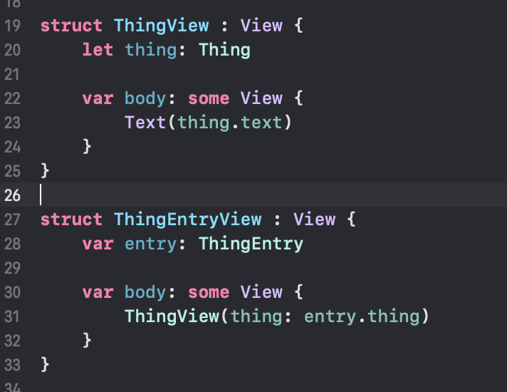
Maybe the ThingEntryView won't carry its weight for long. The ThingEntry is just a timeline implementation detail and maybe nobody else (especially the View hierarchy) should care about it.
A Bigger Thing
I'd like the text in the Widget to be as large as it can be, and shrink if necessary. And I'd like to have some random colours so it catches my eye, so lets have a play with the ThingView.
For the colours I just hacked something together for now, though some better defined palettes might be better. Essentially if we're in light mode the system background for widgets is white so give me a dark-ish colour if we're in dark mode, reverse that.
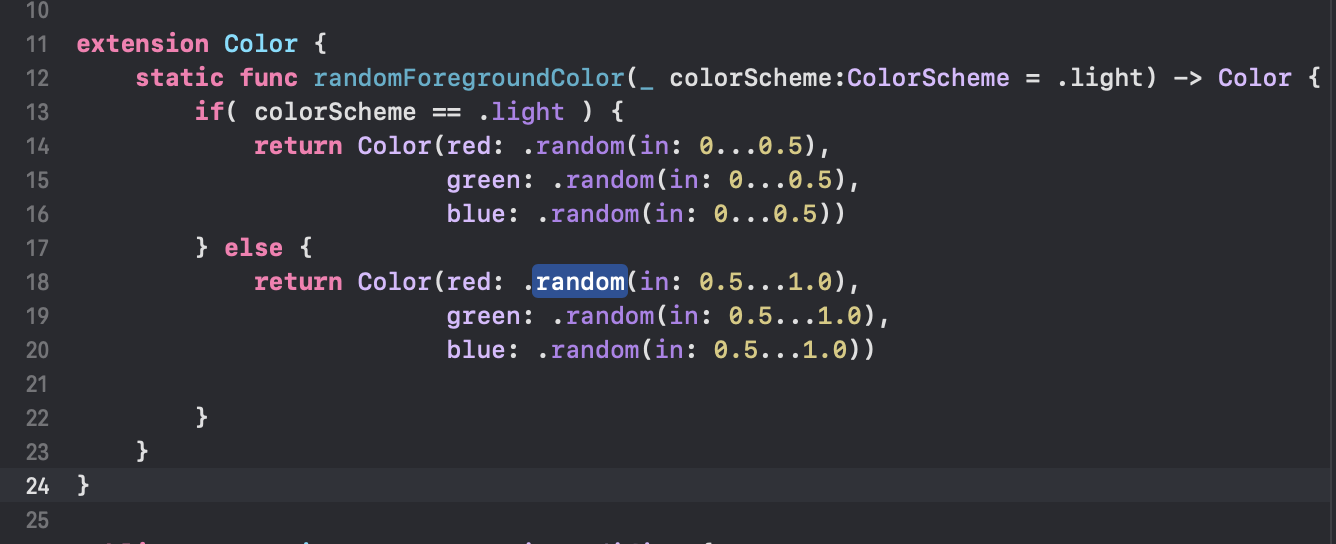
Any View using the colour can access the environment variable colorScheme and then ask for a suitable foreground.
The font sizing was a little more involved. I honestly cant remember all the things I tried before and I cant remember how I ended up with this snippet, but the first time I hacked this app together this is what I ended up with:
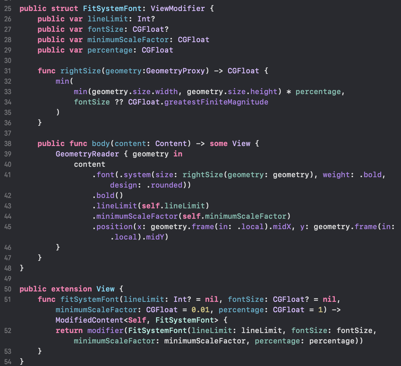
In essence it lets me attach a view modified which calculates the largest font size for the area, given some line limit and minimum scale factor. Suggestions very welcome for a better way to do it.
Both of these are in a file in WidgetShared called InterfaceExtensions.swift
So, I changed my ThingDatastore to have some random, different-sized Things and here's the result in dark and light modes in a variety of widget sizes.
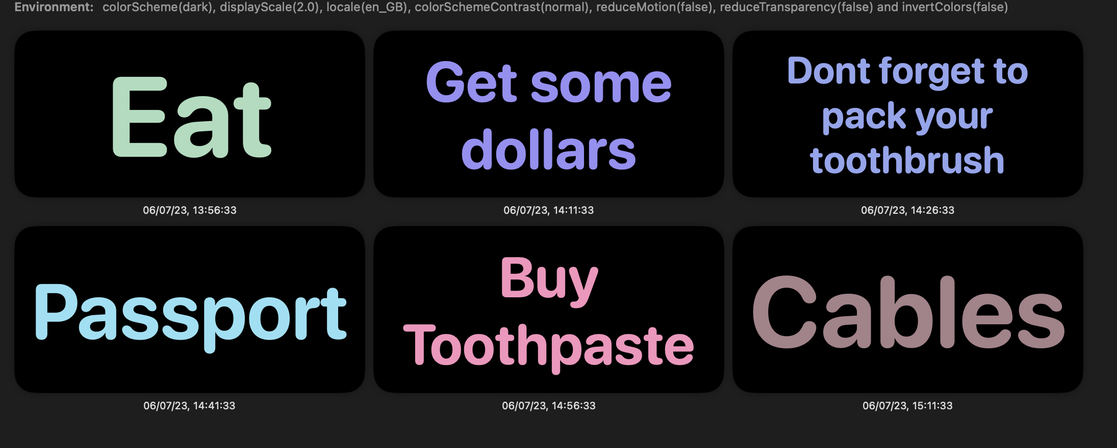

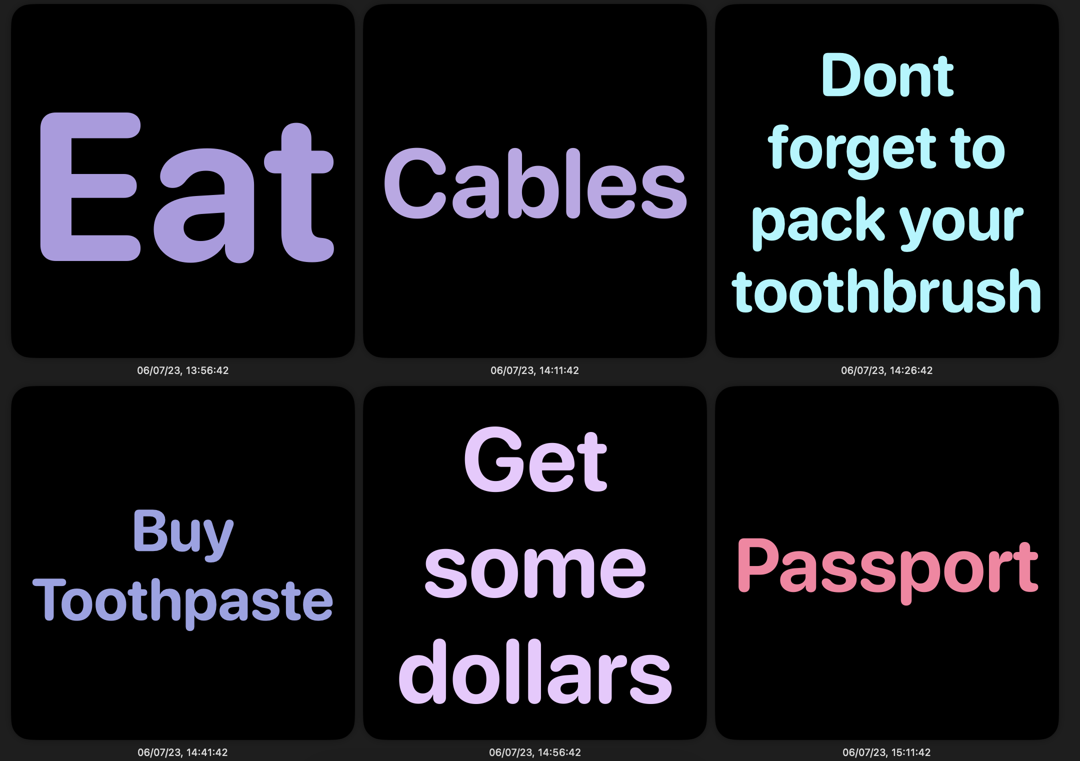
So far so good. Random colours so it looks different enough that I don't start to ignore it, and sized to make the best use of space.
Like the colours it would probably be better to have a standard "palette" of sizes to at least provide some consistency, but I'm not anticipating seeing multiple widgets together at once so I don't mind one at 16 points and another at 17 points. There'll be one widget on my phone Home Screen and one on my Mac sidebar. I have an idea to use the Configuration to maybe show two Things side by side in a medium widget, or stacked on top on a large widget, but that can wait for now.
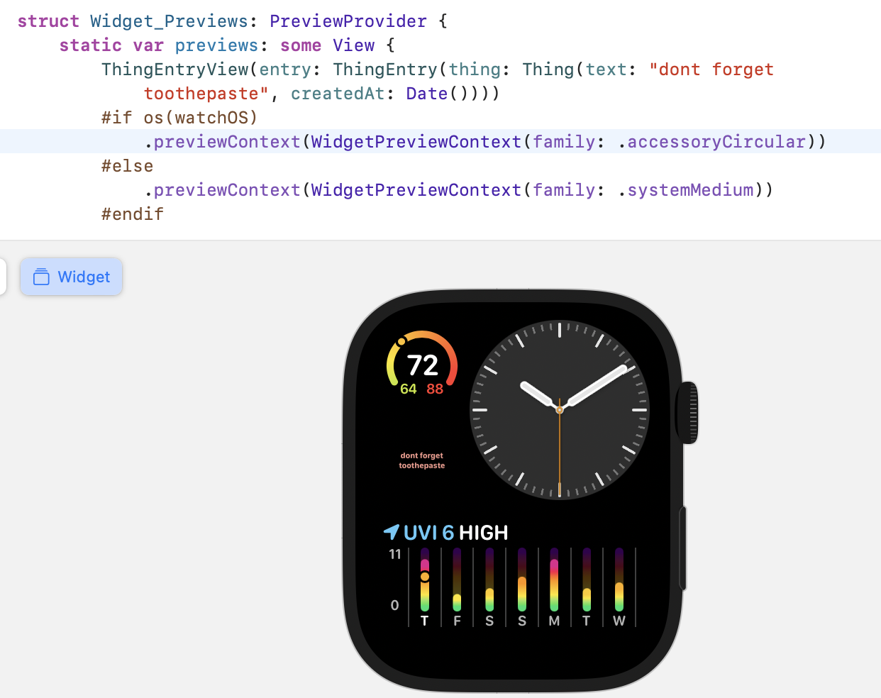
One problem I noticed is only obvious if you play around with previews. I changed the preview Thing to be a longer text and I changed the preview context to accessoryCircular. You can see how tiny the text is there to the left of the clock. Perhaps we'll want to do something different for an accessory widget (phone Lock Screen will be the same), but accessoryInline and accessoryRectangular both look fine on the watch
So that seems like a good place to commit ("Part 5: Fonts and Colours") and start thinking about different kinds of widgets for different situations.